New identity & portfolio site for food, interiors and lifestyle photographer Charlotte Bland.
New identity & portfolio site for food, interiors and lifestlye photographer Charlotte Bland.
New identity & portfolio site for food, interiors and lifestlye photographer Charlotte Bland.
New identity & portfolio site for food, interiors and lifestyle photographer Charlotte Bland.
New identity & portfolio site for food, interiors and lifestyle photographer Charlotte Bland.
Charlotte Bland is a lifestyle photographer with a focus on food, interiors and travel. Charlotte approached me in 2015 to create a new identity and design a new website to showcase her portfolio.
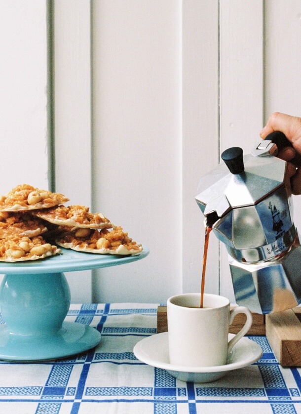
Focusing on real life situations, Charlotte chooses to shoot film instead of digital. This results in an imagery that has a distinctive look and feel. The identity and website needed to reflect this; therefore I opted for a route that was simple, confident and timeless.
Charlotte Bland is a lifestyle photographer with a focus on food, interiors and travel. Charlotte approached me in 2015 to create a new identity and design a new website to showcase her portfolio.
Focusing on real life situations, Charlotte chooses to shoot film instead of digital. This results in an imagery that has a distinctive look and feel. The identity and website needed to reflect this; therefore I opted for a route that was simple, confident and timeless.
Charlotte Bland is a lifestyle photographer with a focus on food, interiors and travel. Charlotte approached me in 2015 to create a new identity and build a website to showcase her portfolio.
Focusing on real life situations, Charlotte chooses to shoot film instead of digital. This results in an imagery that has a distinctive look and feel. The identity and website needed to reflect this; therefore I opted for a route that was simple, confident and timeless.

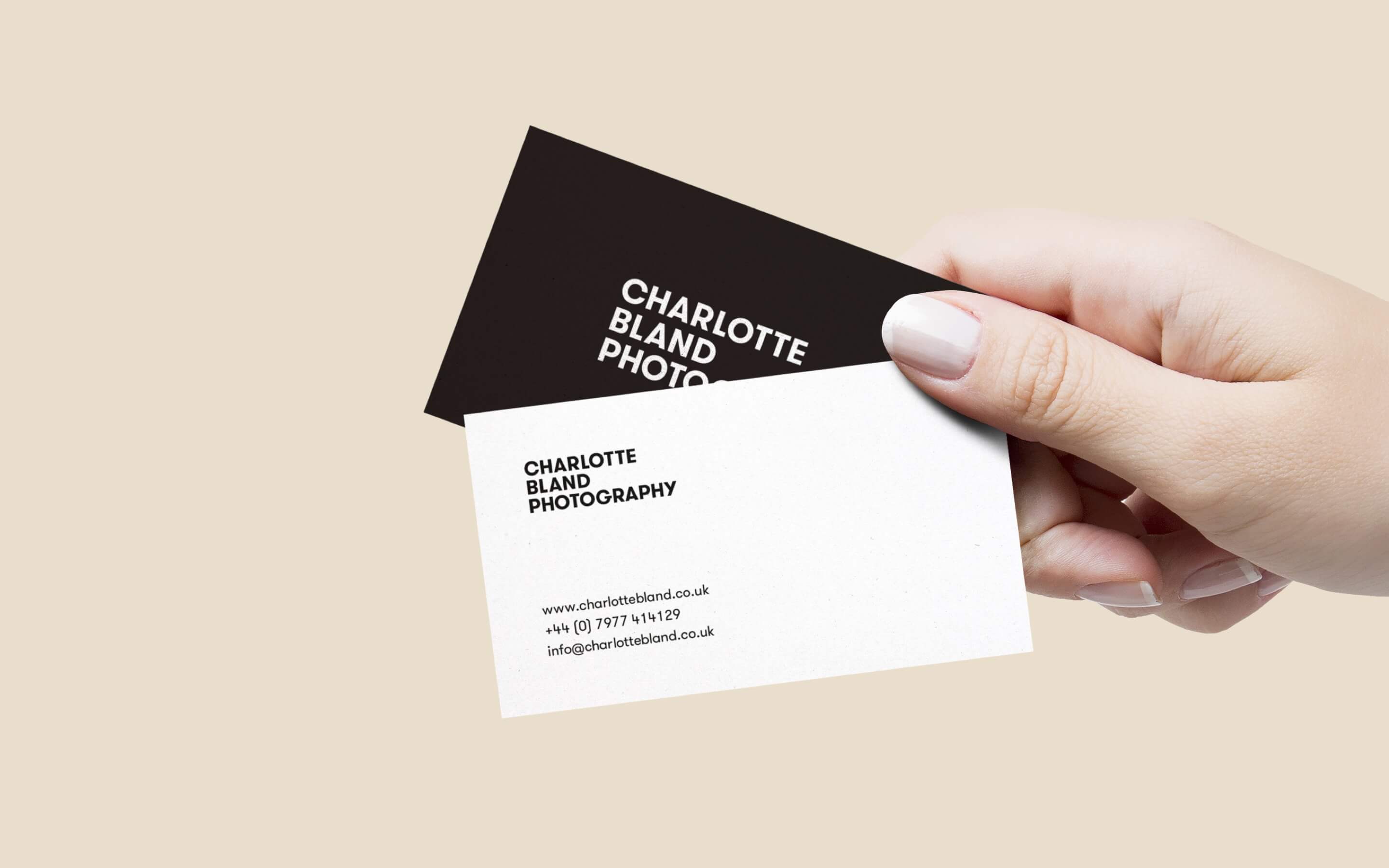
The business cards were printed on black and white duplexed colorplan and featured a white foil finish on the logo.
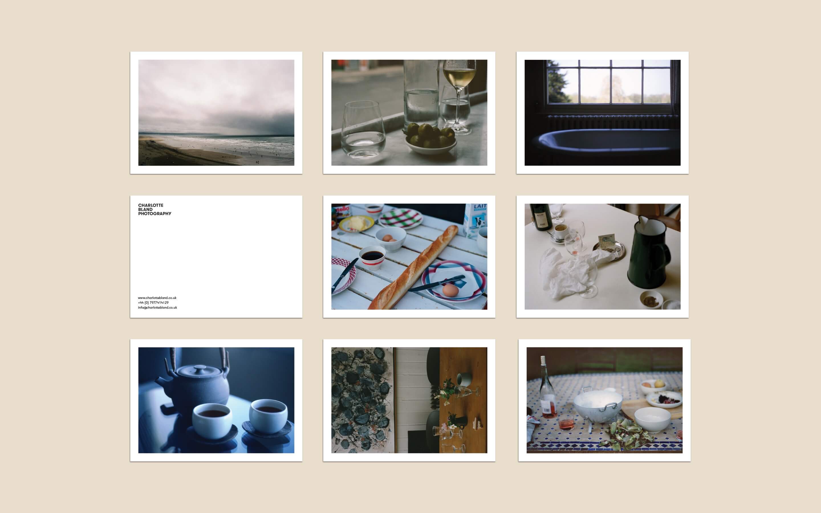
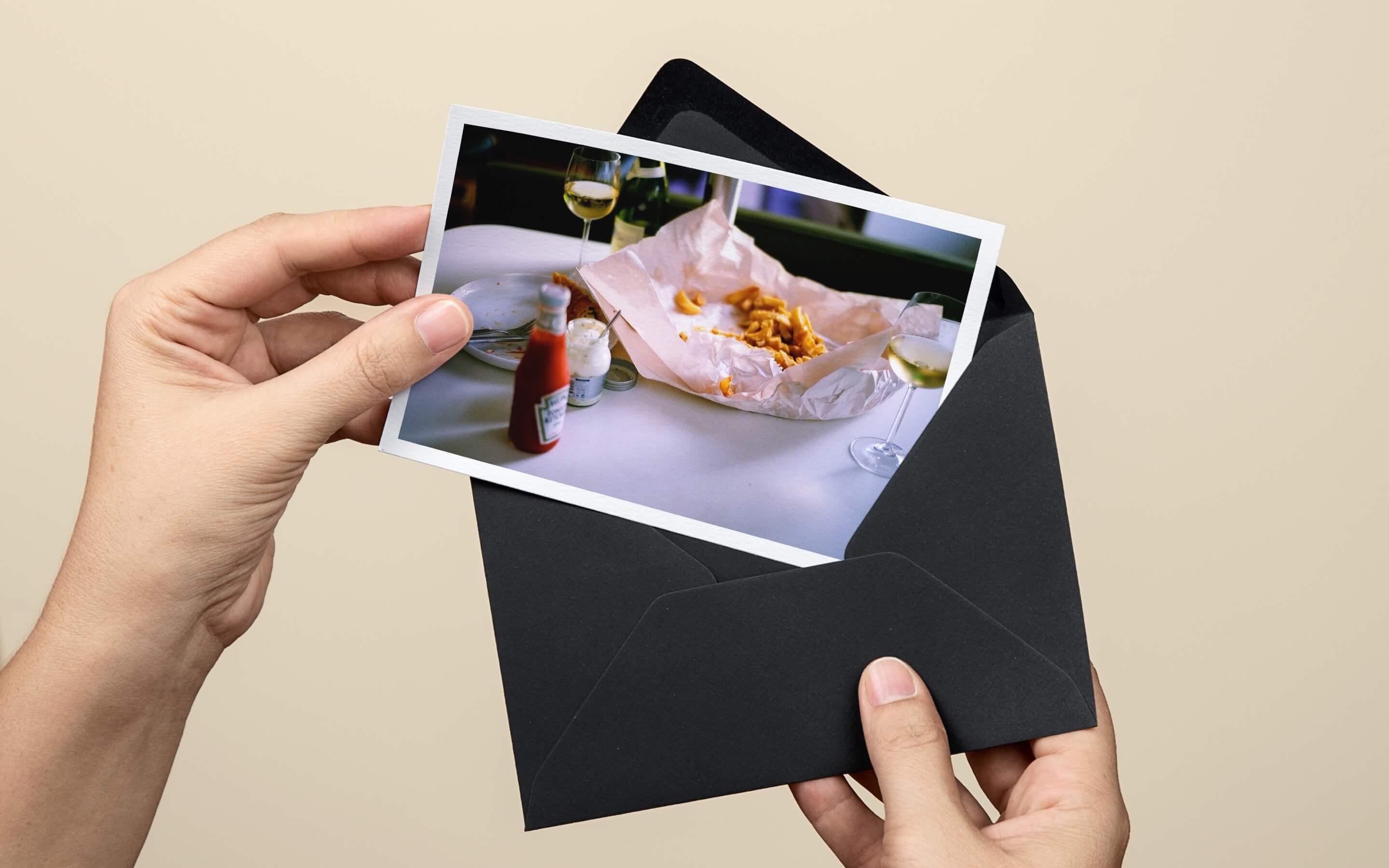
For marketing material, we printed a set of postcards that helped showcase the photography. These were sent out as a pack to various agencies and contacts within the industry.
The business cards were printed on black and white duplexed colorplan and featured a white foil finish on the logo.
For marketing material, we printed a set of postcards that helped showcase the photography. These were sent out as a pack to various agencies and contacts within the industry.
The business cards were printed on black and white duplexed colorplan and featured a white foil finish on the logo.
For marketing material, we printed a set of postcards that helped showcase the photography. These were sent out as a pack to various agencies and contacts within the industry.
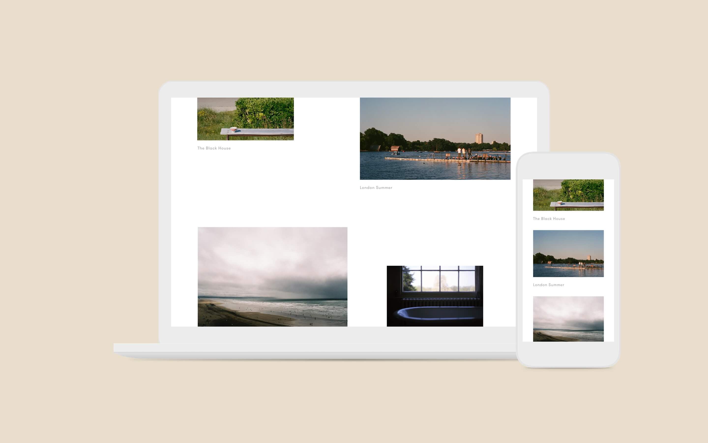
Due to the nature of the photography, I was keen for the website to have a clean editorial look and feel. The homepage had a flexible grid which allowed for images to be uploaded at different sizes.
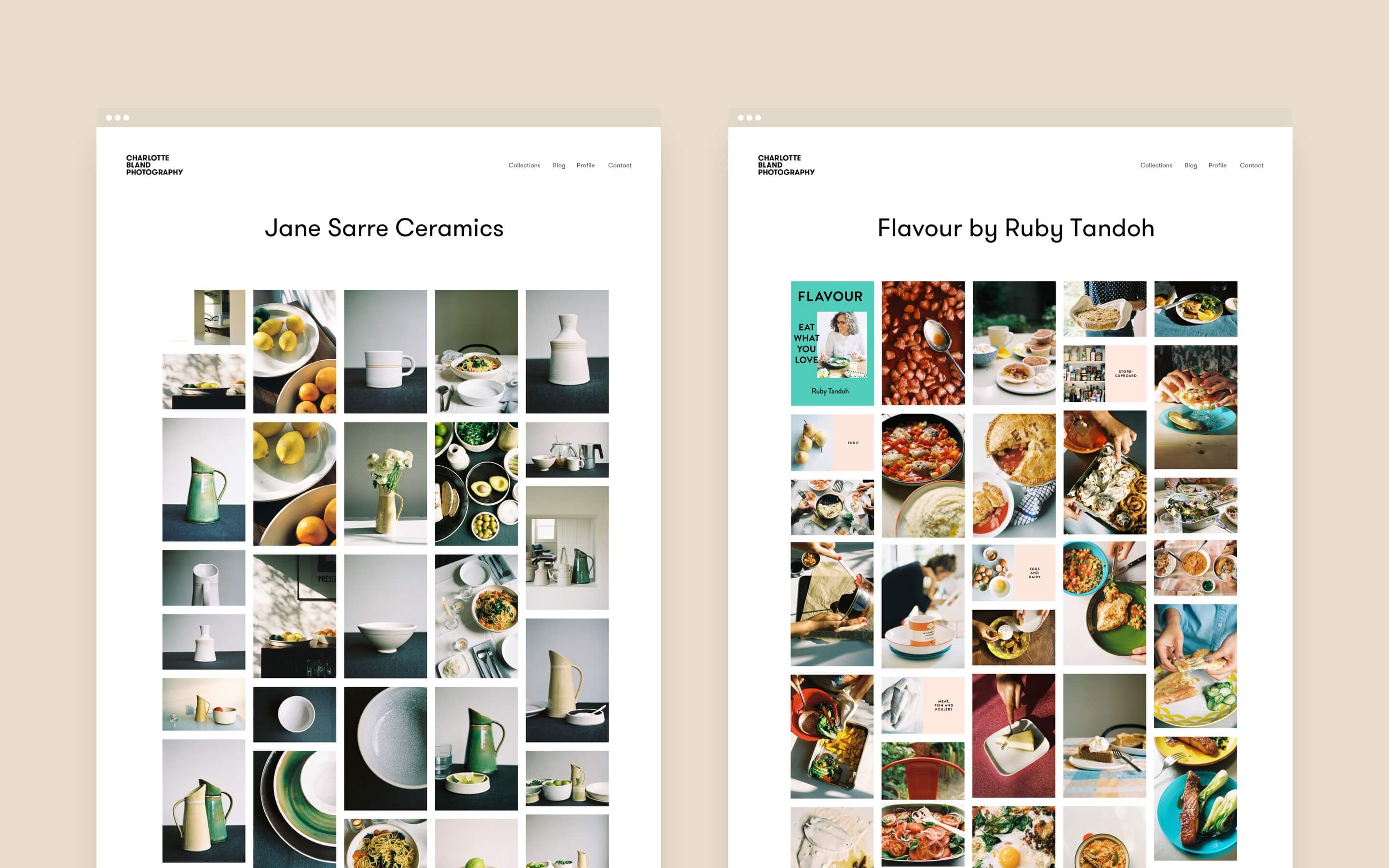
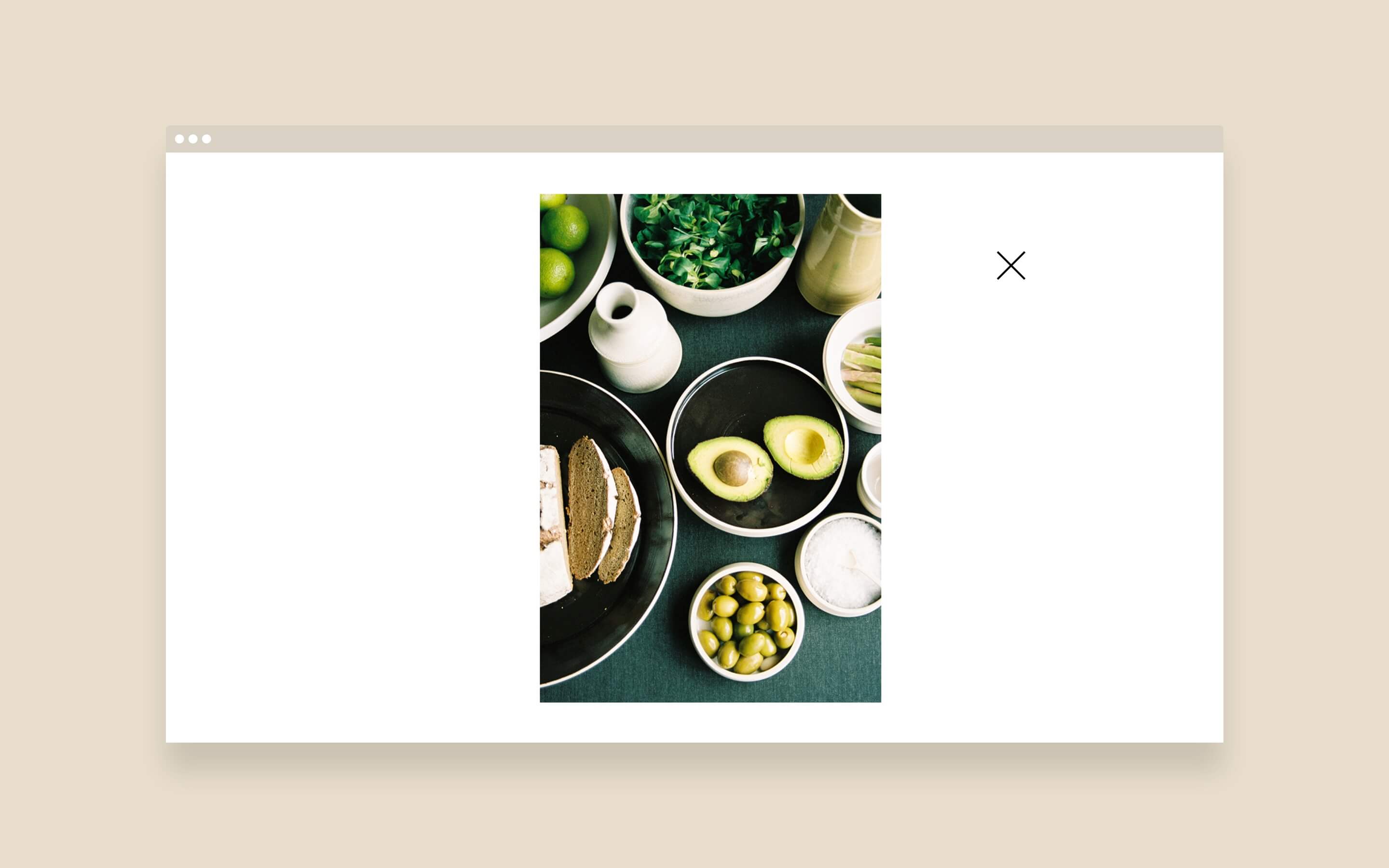
Charlotte was keen to showcase the full range of images in each gallery. So we used masonry grid layout to display the images and users could then click on an image to view in a full screen gallery. Showcasing the photography in this way highlighted how well the images compliment each other when viewed as a collection.
Due to the nature of the photography, I was keen for the website to have a clean editorial look and feel. The homepage had a flexible grid which allowed for images to be uploaded at different sizes.
Charlotte was keen to showcase the full range of images in each gallery. So we used masonry grid layout to display the images and users could then click on an image to view in a full screen gallery. Showcasing the photography in this way highlighted how well the images compliment each other when viewed as a collection.